Data Visualisation
The rate at which data are being created is increasing; according to IBM’s calculations, “every day, we create 2.5 quintillion (2.5 billion billions, or 25 with 17 zeros) bytes of data — so much that 90% of the data in the world today has been created in the last two years alone”. Not only are new forms of computer processing being developed to handle this so called ‘big data’, but the way we are communicating data is also evolving.
In order to digest and understand this volume of information, data visualisation has become increasingly popular. Data visualisation is the graphical representation of data and, when successful, brings together information science, communication and design in perfect harmony. Visualisations can not only make data beautiful, but provide insight and communicate data analysis in an accessible way. Data visualisation provides a powerful way to present data in multiple dimensions, and to simplify complex analyses, for example.
The visual presentation of data is not a new concept. Back in the 19th Century Florence Nightingale was a pioneer in statistical graphics and famously used her ‘Coxcombs’ diagrams (shown below) to highlight the greater deaths from disease compared to wounds in the Crimean War, thereby promoting sanitation in hospitals.
However, visualisation techniques and the tools available to produce visualisations have certainly developed in recent years. Whereas simple black on white plots and charts were the main staple in the past, intricate colour graphics and innovative dynamic and interactive data visualisations are now prevalent.
Many visualisation tools are now publically available on-line, which allow anyone to produce their own dynamic and interactive figures. Hans Rosling, one of the fathers of modern visualisation, helped to develop Trendalyzer as co-founder of Gapminder, which is an animated visualisation software system using interactive bubble plots. Trendalyzer is now available for public use as Google Charts. Rosling’s wonderful BBC documentary “The Joy of Stats” shows some great uses of dynamic graphs, including an exploration of the health and wealth of nations as countries have developed since 1800, which is available to view at gapminder.org.
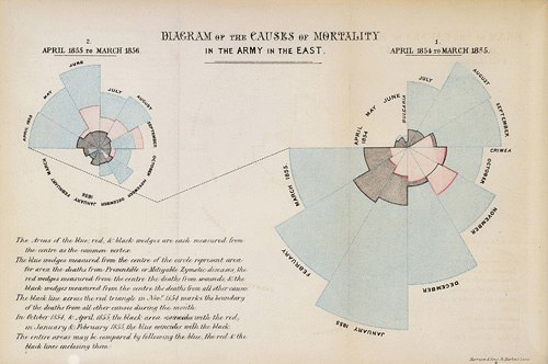
One of Florence Nightingale’s ‘coxcombs’ diagrams highlighting the greater deaths from diseases compared to wounds in the Crimean War, promoting sanitation in hospitals.
However, more is not always better and simple, well-designed visualisations can be the clearest and most digestible. The ONS (Office for National Statistics) and their work with the Census 2011, the biggest statistical operation ever undertaken in the UK, provides a great example of some simple, but powerfully effective visualisations.
Their population pyramid by age and sex, in 2001 and 2011, for example, makes it easy to compare the age profile of the population over time, and between genders, in one simple graphic. As highlighted in the figure below, it is easy to identify key events that have affected the resident population over time, such as the 1960’s baby boom.
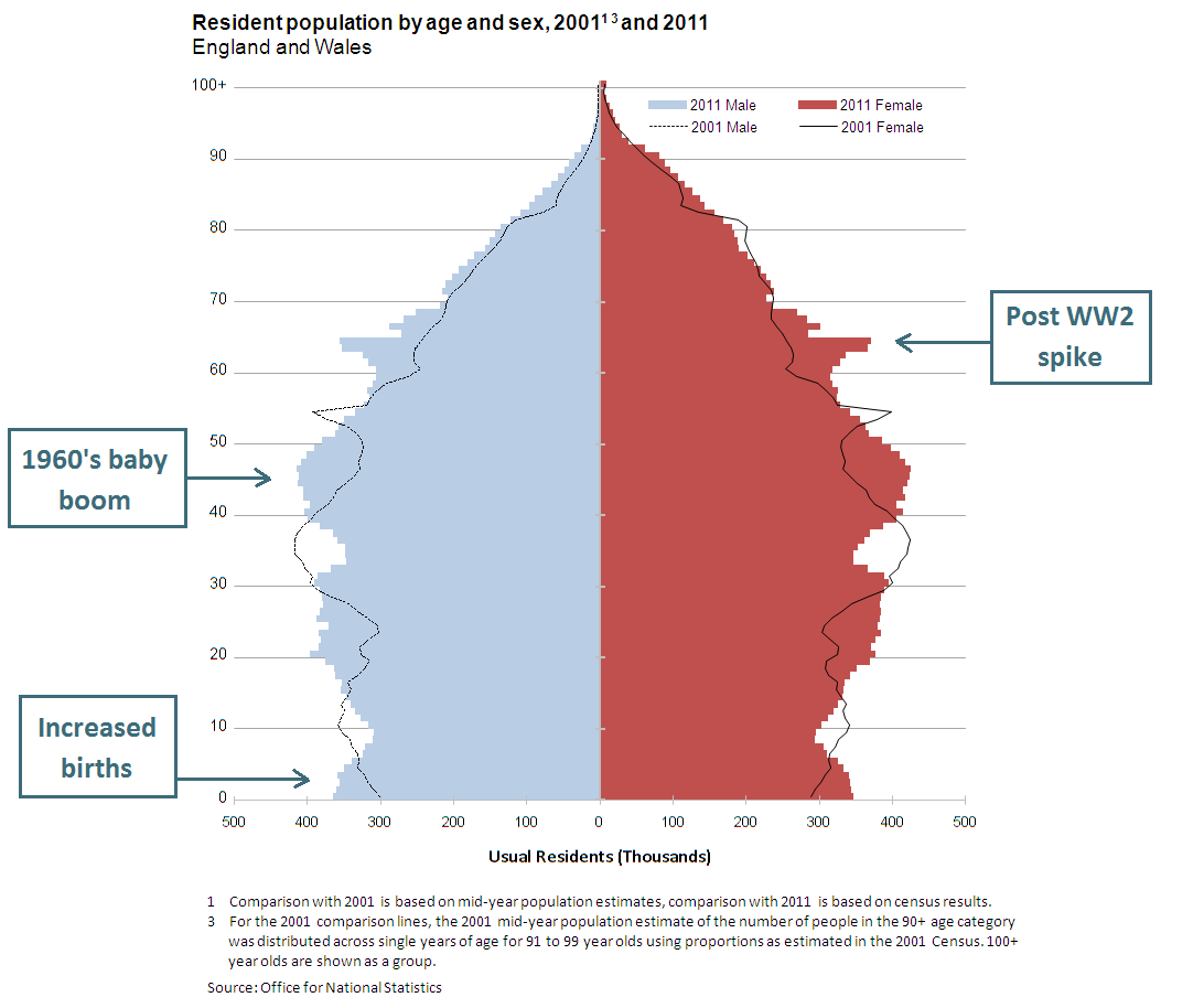
ONS population pyramid by age and sex, in 2001 and 2011.
Similar work has also been undertaken by the US Census Bureau to make their data more accessible. Interactive population maps, available on their website, for example, provide a great way to show the geographical breakdown of population counts and demographic details across the United States. Nathan Yau (a blogger at FlowingData.com and author of Visualize This) who promotes the use of visualisations to “tell a story with data”, talks about some other great visualisation work done with the 2010 US Census data in this YouTube video.
Another example of an informative, and also beautiful, graphic comes from the OECD and their work on measuring subjective well-being – How’s Life? In their interactive visualisation that lets users explore the data for themselves, flowers represent different countries with 11 ‘better life’ indexes depicted as petals (you can click on this figure below to view an enlarged version).
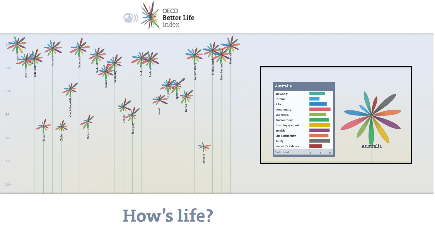
OECD How’s Life? interactive ‘flower’ visualisation.
Unfortunately, there are also plenty of examples of not so good practice around. If the balance is wrong, clutter can lead to confusion and so-called ‘chart junk‘ can detract from the information being displayed. Worse still, poor visualisations can be misleading – take this list of examples from Fox News. Hence, it is essential to rationalise design choices to best reflect the data and/or analysis being presented. We should always be mindful that a visualisation may highlight interesting trends or differences in a dataset, but that to draw reliable conclusions from these insights requires more rigorous statistical methods.
The Royal Statistical Society’s statistical literacy campaign ‘getstats’ and The World of Statistics are two movements that are currently working towards increasing public understanding of statistics and improving the way that we all handle data. They present a great opportunity to also promote good data visualisation.
Related Articles
- Google Chart Tools (developers.Google.com)
- Google Data Visions (Google.com)
- Guardian DataBlog
- Guardian Data Visualisation
- Understanding Uncertainty Animations (UnderstandingUncertainty.org)
- Significance: A Life in Statistics – Nathan Yau (Wiley.com)
- 10 Fascinating Data Visualization Projects (Mashable.com)
- Constructive criticism of the graphics of climate science (BetterFigures.org)