Hidden Data and Surviving a Sinking Ship: Simpson’s Paradox
When dealing with data it generally pays to be curious and, rather than take them at face value, to ask “Where did the data come from?”, “How were they obtained?” and even “What information is missing?” Blindly analysing the data without properly understanding their provenance and context can lead to surprisingly misleading results, especially if there are influential factors that you either ignore or fail to record.
Take the following example based upon survivor records from the RMS Titanic. Tallying the adult casualties for third class passengers and crew members, we get the following table (numbers are as per Lord Mersey’s Report from the British inquiry into the sinking).
| Class | Saved | Lost | Total | Survival Rate |
| Third | 151 | 476 | 627 | 24.08% |
| Crew | 212 | 673 | 885 | 23.95% |
The survival rate was very slightly higher for third class passengers than for crew members but, from a statistical perspective, there is no evidence to suggest that there was any real difference between the survival rates for the two groups.
However, if we take a more detailed look, breaking the numbers down for men and women, we get the following table.
| Men | Women | |||||||
| Class | Saved | Lost | Total | Survival Rate | Saved | Lost | Total | Survival Rate |
| Third | 75 | 387 | 462 | 16.23% | 76 | 89 | 165 | 46.06% |
| Crew | 192 | 670 | 862 | 22.27% | 20 | 3 | 23 | 86.96% |
We can now see that, for both men and women, the survival rates were actually higher for crew members compared to the third class passengers, 22% vs 16%, and 87% vs 46%, respectively. How can both of these tables be correct? One says that the overall survival rate was, if anything, higher for third class passengers, whilst the other says that the male and female survival rates were considerably higher for crew members.
The apparent contradiction occurs because the relationship between survival and class is influenced by a hidden or “confounding” variable, in this case gender, which we ignore in the first table. Table 2 shows that the survival rate was much lower for men compared with women on board the Titanic – in general, it was “women and children first” when it came to getting a seat on a lifeboat. Table 2 also shows that there were a greater proportion of women in third class than in the crew – more than a quarter of third class passengers were women whereas less than 3% of the crew were female. In this case, the difference in the proportion of women amongst the third class passengers and crew has a substantial impact on the overall survival rate for each group and has the unfortunate effect of masking the third class passengers vs crew effect when gender is ignored in the original table.
This is an example of the mathematical phenomenon known as Simpson’s Paradox (named after the British statistician Edward Simpson), where trends within sub-populations can be reversed when the data are aggregated. In the case above, the first table appeared to prove the complete opposite of the truth. It’s an extreme example, but it serves as a cautionary tale, highlighting the care that needs to be taken when interpreting data.
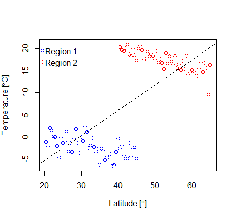
Figure 1: Scatterplot of the temperature (°C) recorded at various latitudes (°) in two different geographical regions (simulated data)
Simpson’s Paradox occurs with continuous data as well as count data. For example, suppose that we were to conduct a study that involved recording the temperature at various latitudes in two different geographical regions. Plotting these data, in the figure above, we can see that for each region (blue and red points) there is a negative relationship between the temperature and latitude – as the latitude increases (i.e., we get further from the equator at 0°, towards the north Pole at 90°), the temperature tends to decrease. However, if we simply ignored the regions there appears to be a clear and positive relationship between latitude and temperature (shown by the dashed black line on the figure representing a simple linear regression on the entire data), which is clearly false. This is another (albeit more easily identified) example of Simpson’s Paradox – the trend that is observed within each individual region is reversed when they are combined.
So, how can you avoid being caught out by Simpson’s Paradox? Undertaking a thorough exploration of the data before conducting your analysis can go a long way to help. Graphical summaries, such as scatterplots, can be used to establish whether there are any strong relationships between continuous variables. For example, a simple scatterplot in the temperature example above clearly shows that there are distinct clusters (even without the coloured points), making it clear that there are two groups which, in this case, we know to be due to regional differences. If we’d not recorded the regional data we would still have known that there were two distinct groups we just wouldn’t have known why.
In contrast, without recording gender it would be impossible to tell that there was a problem with the natural conclusions drawn from the aggregated Titanic data in Table 1. This illustrates another important point: that it’s crucial to identify from the outset what factors are likely to affect your data and to record information on each and every one of them so that you can assess their effect. This is particularly relevant when it comes to interpreting evidence from observational studies (as opposed to controlled experiments) where we may not know what influential factors exist.
Without properly understanding the context of your data and the likely drivers, you could end up with seemingly convincing evidence in support of conclusions quite contrary to the truth.
Related Articles
- Simpson’s Paradox: A Cautionary Tale in Advanced Analytics (SignificanceMagazine.org)
- Confounding and Simpson’s paradox (bmj.com)
- Sex Bias in Graduate Admissions: Data from Berkeley (unc.edu)